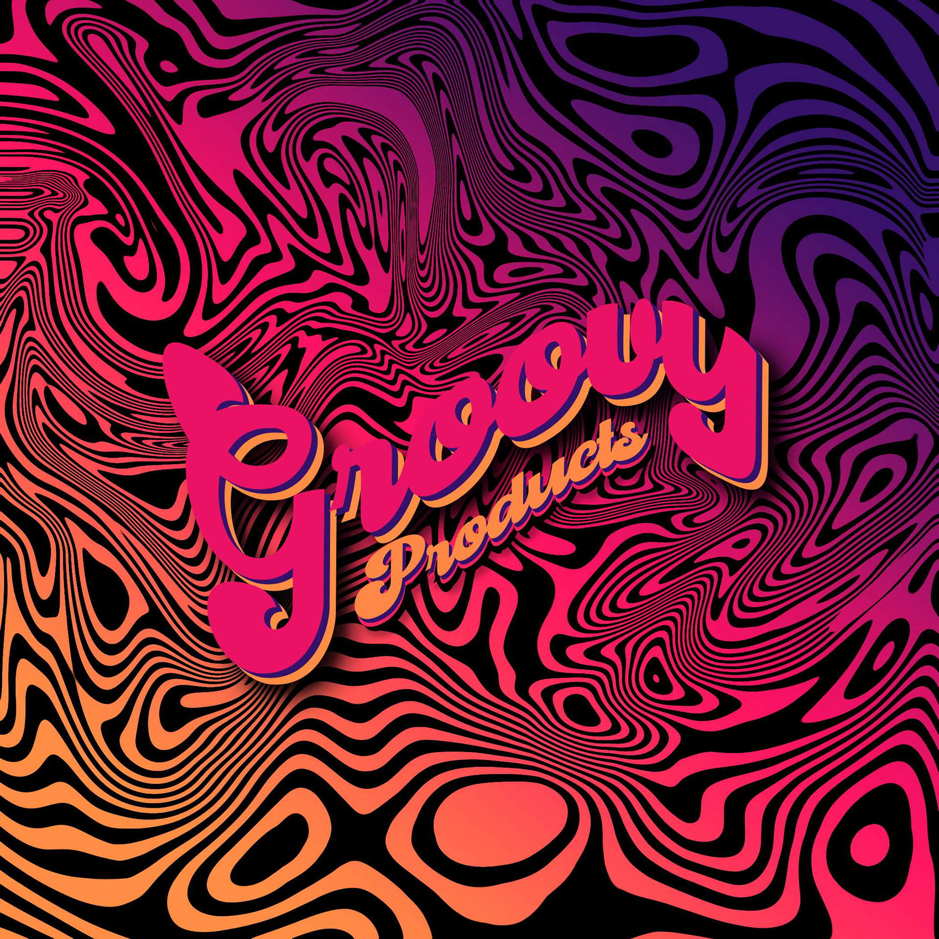
I made the process of creating a logo and flyer for a new bracelet business more appealing to customers by incorporating a late 70s to 80s theme with a modern twist. It was challenging to find the right font, but I was able to solve this by searching outside of the program for more interesting options. I also experimented with different color patterns to ensure they complemented each other and used the blend tool to create a seamless design. The most difficult part was creating the background design, but I played around with simple stripes and patterns until I found the perfect combination. Overall, I am proud of the final result and how it turned out for both the logo and the price flyer.
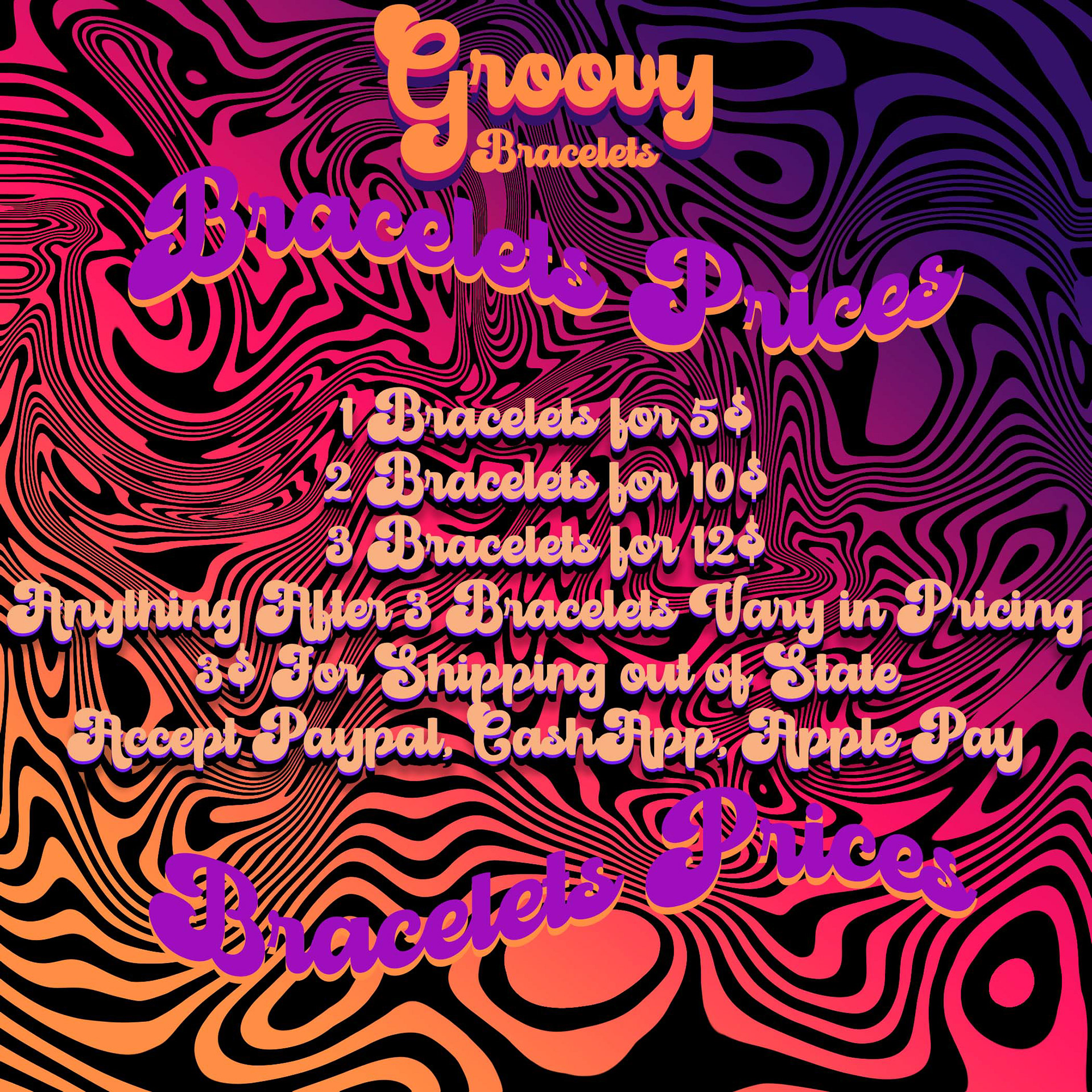
I designed the back cover of my small business flyer to match the color scheme and patterns of the front logo page. However, I struggled to choose the right font colors that would be legible and not blend into the background. To solve this problem, I used darker colors and added an outline color behind the font. For the fonts, I used brighter colors for the darker side of the background colors and darker colors for the lighter side of the flyer. I am happy with the outcome and believe the changes have made the flyer more visually appealing.
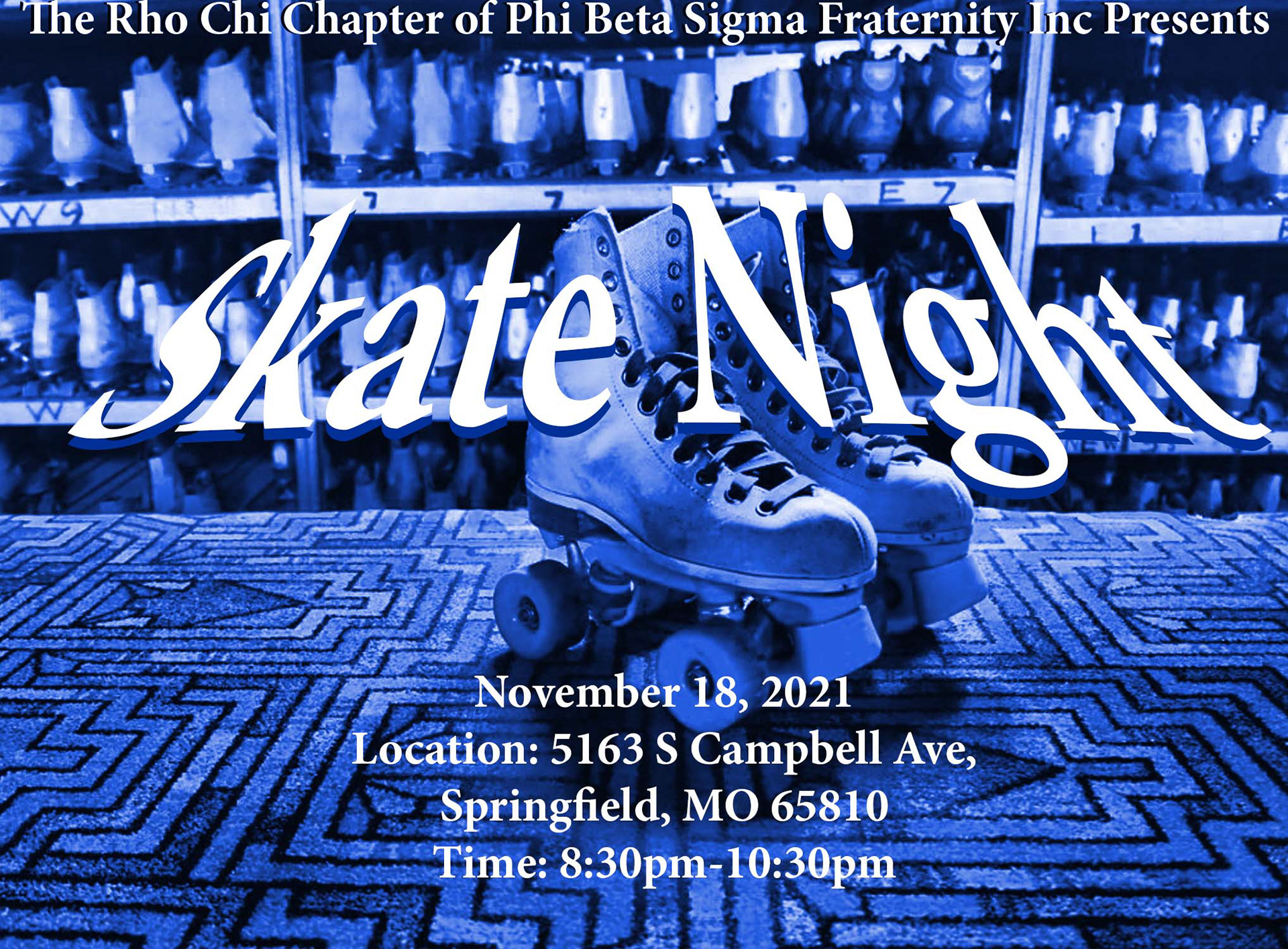
For the skate night flyer, I aimed for a simple and appealing design. To achieve this, I used various shades of blue that complemented each other. I also adjusted the background color to a complete blue and ensured that the shadows were not too dark, by checking the overall brightness of the portrait. To make the title more noticeable, I added a darker blue outline and blended it with the background.

I recently worked on a flyer for an organization, which had a simple design. The main focus of the flyer was mental health, so I chose a dark blue color scheme with a serious tone. The background picture and font were chosen carefully to complement each other and make the white font pop out. I added a slight outline to the font to make it stand out even more. Overall, the design was simple, yet impactful, and effectively conveyed the seriousness of the topic.

This flyer was created to announce the presentation of new members. The aim was to make sure that everyone was aware that new members would be showcased. The flyer was inspired by the Stephen King movie "It," but it was decided to keep it simple. The main challenge was to choose a readable font that would stand out against the dark clouds in the background. The flyer's color theme was royal blue. The main focus was to make the flyer interesting and encourage everyone to attend the event. Overall, the flyer was successful in achieving this goal by effectively placing all the details and creating a design that resembled a movie flyer.

This is a project I'm working on called "The Lighter Side of the Moon". My goal is to improve my artistic abilities by experimenting with different tools and creative techniques. In this particular project, I played around with various effects in Photoshop to give the moon a blue hue. One of the challenges I faced was finding the right filter to complement the blue and make it look natural. Despite the difficulties, I've learned a lot and feel like I'm making progress towards becoming a better artist. This project has been a great opportunity for me to explore new tools and techniques, and I'm excited to continue learning and growing.